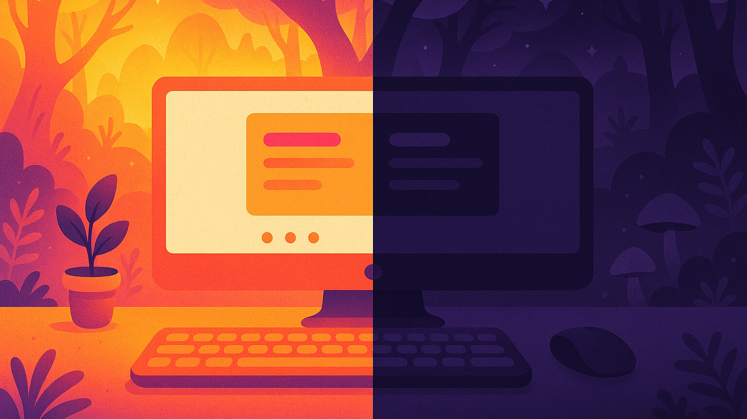
Research shows that positive polarity (dark text on a light background) generally gives better legibility, especially with small text or in bright rooms. Dark mode, however, can feel more comfortable in dim environments and may reduce glare.
Try this 30-minute test
Before choosing one mode as your default, try this quick experiment:
- Spend 30 minutes working in your usual lighting with light mode. Rate your comfort from 1–10.
- Switch to dark mode for the next 30 minutes and rate again.
- If one mode scores 2 or more points higher, prefer it in similar lighting conditions.
This works because comfort isn’t just about the mode—it’s about the match between your screen, your surroundings, and your task.
The one-minute rule
A simple shortcut for everyday use:
- If a white page looks like a lamp in your room, go with dark mode.
- If the room is bright, or you have a bright window behind you, use light mode.
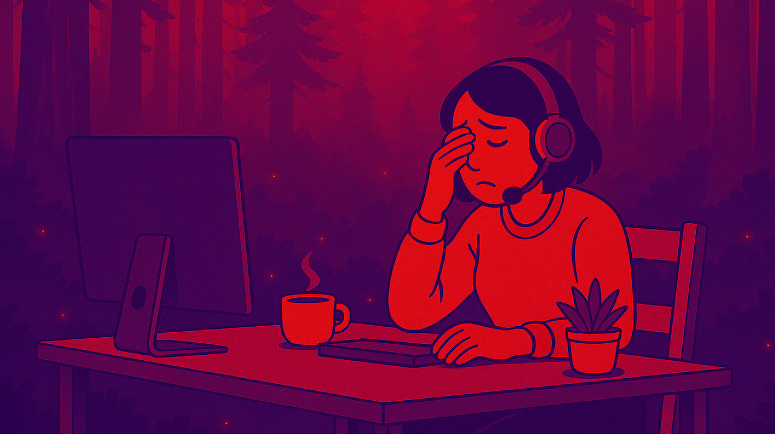
Your eyes are happiest when screen brightness is close to room brightness. Large differences can make the screen feel harsh or the text look faint, and prolonged brightness mismatch may reduce blink rate, leading to dryness and other digital eye strain symptoms.
Why this works
The short answer
Light mode is easier to read in bright rooms. Dark mode reduces glare in dim rooms.
The deeper reason
Polarity matters. Dark text on light backgrounds gives sharper edge definition for small type. Light text on dark reduces overall luminance, which can be gentler in low light, but fine details can be harder to see—especially with thin fonts or low-contrast themes. Adjusting font size and weight helps counteract these downsides.
Practical guidelines
In dim rooms, dark mode usually feels better. Increase your font size by one step for easier reading. In bright rooms, light mode offers better clarity. Reduce glare and reflections by adjusting your screen angle or using an anti-glare filter.
For long-form reading—like articles, PDFs, or research—light mode tends to be easier for comprehension. If you prefer dark mode, boost the font size or weight.
For coding, design, or content creation, test both. Many developers prefer dark mode for syntax visibility, but increase the weight of thin fonts if they look faint.
Avoid switching modes in the middle of a task. Change them during breaks so your eyes have time to adjust.
Making dark mode more comfortable
If you love dark mode but find your eyes feeling heavy and tired over time, try these small adjustments:
- Use dark gray backgrounds instead of pure black. They offer more comfortable contrast and align with accessibility guidelines.
- Increase text size slightly.
- Tone down bright, saturated colors.
- Add a soft bias light behind your monitor to reduce the perceived brightness difference between screen and surroundings.
- Enable font smoothing or anti-aliasing in your OS settings to keep edges crisp.
FAQ
Does dark mode save battery?
Only on OLED screens, where black pixels consume less power. On LCD screens, there’s little to no difference.
Is dark mode bad for reading?
For extended reading, light backgrounds usually help with speed and accuracy. Dark mode is fine for short tasks or dim settings.
Should I use blue-light filters?
Blue-light filters aren't a cure for eye strain. High-quality studies find little to no difference in comfort compared to clear lenses. Use them if you like the warmer tone at night.
Quick checklist
- Run the 30-minute test.
- Match mode to room brightness.
- Increase text size or weight in dark mode.
- Use bias lighting in dark rooms.
- Rest your eyes for 2 minutes every 90 minutes.
Opinion: Dark mode is like sunglasses—great in some situations, not in others. The best advice? Try it for 30 minutes. If it feels better, keep it.
References
- Nielsen Norman Group. Dark Mode vs. Light Mode: Which Is Better? https://www.nngroup.com/articles/dark-mode/
- Dobres J, et al. Effects of ambient illumination, contrast polarity, and letter size on text legibility. Applied Ergonomics, 2017. https://www.sciencedirect.com/science/article/abs/pii/S0003687016302459
- Buchner A, Mayr S, Brandt M. The advantage of positive text-background polarity is due to high display luminance. 2009. https://www.psychologie.hhu.de/fileadmin/redaktion/Oeffentliche_Medien/Fakultaeten/Mathematisch-Naturwissenschaftliche_Fakultaet/Psychologie/AAP/Publikationen/2009/Buchner_Mayr_Brandt__2009_.pdf
- Nielsen Norman Group. Dark Mode: How Users Think About It and Issues to Avoid. https://www.nngroup.com/articles/dark-mode-users-issues/
- American Academy of Ophthalmology. Computers, Digital Devices, and Eye Strain. https://www.aao.org/eye-health/tips-prevention/computer-usage
- Akkaya S, et al. Effects of long-term computer use on eye dryness. 2018. https://pmc.ncbi.nlm.nih.gov/articles/PMC6371992/
- Material Design. Dark theme guidance. https://m2.material.io/design/color/dark-theme.html
- Flanders Scientific. Reference Viewing Environment. https://flandersscientific.com/tech-resources/ReferenceViewingEnvironment.pdf
- Cochrane Review 2023. Blue-light filtering spectacle lenses for visual performance and sleep. https://www.cochranelibrary.com/cdsr/doi/10.1002/14651858.CD013244.pub2/full
- Google at Android Dev Summit 2018 -- OLED power savings in dark mode. https://www.theverge.com/2018/11/8/18076502/google-dark-mode-android-battery-life
- Purdue University. Dark mode may not save your phone’s battery life as much as you think. https://www.purdue.edu/research/features/stories/dark-mode-may-not-save-your-phones-battery-life-as-much-as-you-think-but-there-are-a-few-silver-linings/
- Varvello M, Livshits B. On the Battery Consumption of Mobile Browsers. 2020. https://arxiv.org/abs/2009.03740
Try LookAway
LookAway is a smart break reminder that helps reduce eye strain, digital fatigue, and maintain better posture - so you can end your day feeling fresh.
Learn more